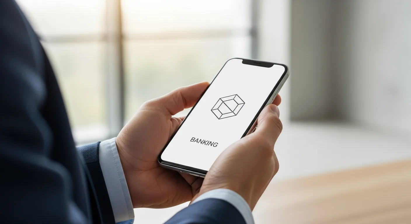

The Psychological Impact of Visual Identity in Finance
In the rapidly evolving digital landscape, a fintech logo is far more than a simple graphic. It serves as a digital handshake, the first point of contact between a financial service provider and his potential customer. When a user explores a new application, he subconsciously looks for visual cues that signal security, stability, and innovation. If the logo fails to communicate these values, the user may hesitate to entrust the platform with his hard-earned capital.
Establishing a visual identity is a core component of a broader fintech branding strategy that aims for long-term market authority. A well-designed logo creates an immediate sense of familiarity, helping a founder distinguish his company in a crowded marketplace where trust is the most valuable currency.
Essential Elements of a Modern Fintech Logo
To create a logo that resonates with modern consumers, a designer must balance traditional financial symbols with contemporary aesthetics. This balance ensures the brand looks established yet forward-thinking.
Color Theory: Beyond Banking Blue
While deep blues have long been the standard for traditional banks due to their association with reliability, modern fintechs are expanding the palette. A founder might choose vibrant greens to represent growth and prosperity, or sleek dark modes to appeal to a tech-savvy demographic. The key is consistency; he must ensure that his chosen colors translate perfectly across mobile interfaces and physical cards.
Typography: Balancing Authority and Innovation
The choice of font says as much about a company as the icon itself. Sans-serif fonts are frequently preferred for their clean, approachable, and modern feel. However, the weight of the font matters. A heavier weight can suggest a solid foundation, while a lighter weight might imply agility and speed. Every stroke of the pen should reinforce the message the entrepreneur wants his brand to convey.
Integrating Design with Product Development
A logo does not exist in a vacuum. It must be functional and scalable across various digital environments. As a developer builds the core architecture, as detailed in our guide to fintech software development, he must coordinate with the design team to ensure the logo scales perfectly from a tiny favicon to a massive billboard without losing its integrity.
In 2026, we are seeing a shift toward responsive logos. These are versions of a logo that change in complexity depending on the screen size. A founder might use a full wordmark for his website but transition to a simplified monogram for the app icon on a user’s smartphone. This adaptability shows that he understands the nuances of the modern user experience.
Trends Shaping Fintech Design in 2026
- Minimalist Geometry: Using simple shapes like circles and squares to represent unity and structure.
- Motion-First Design: Logos designed with animation in mind, providing a dynamic feel when the app is loading.
- Abstract Symbolism: Moving away from literal icons like coins or safes toward abstract shapes that represent flow and connectivity.
- Gradient Depth: Using subtle color transitions to give the logo a three-dimensional feel on high-resolution screens.
How to Brief Your Designer for a Winning Result
When a CEO decides to refresh his visual identity, he must provide a clear and concise brief. He should outline his target demographic, his company’s core values, and the specific emotions he wants his brand to evoke. It is not enough to say he wants a “cool logo”; he must define what “cool” means in the context of financial security and user empowerment.
He should also consider the longevity of the design. A logo that follows a fleeting trend might look dated within a year. Instead, he should aim for a timeless aesthetic that can evolve alongside his company’s growth and technological advancements.
Frequently Asked Questions
What is the most common color for a fintech logo?
Blue remains the most common color because it is psychologically linked to trust, intelligence, and stability. However, many modern firms are now using purple or teal to stand out from traditional banks.
Why is simplicity important in fintech branding?
Simplicity ensures that the logo is recognizable even at small sizes, such as on a mobile notification bar. It also suggests that the financial service itself is easy to use and transparent.
Should a fintech logo include a symbol of money?
Not necessarily. While coins or dollar signs were common in the past, modern fintechs often use abstract symbols that represent movement, security, or the “link” between the user and his finances.
How often should a company update its logo?
A complete redesign is rarely needed if the original design is solid. However, a founder might choose to “refresh” his logo every 5 to 7 years to keep the typography and color shades looking modern.